
Zuperior / Withdraw Funds — Mobile Wallet
One screen,three real states.
Zuperior is a mobile wallet app. This is its Withdraw Funds screen — cashing out via crypto or bank transfer, or moving funds instantly between your own accounts — designed across every state a real balance actually goes through.
Role
Senior UI Designer
Ownership
Sole designer
Tags
Figma, UI Design, Design System, Mobile App Design
Year
2026
Context
Before identity verification, a user can see their balance and withdrawal methods, but can't touch them. After, every method unlocks at 0% fees, and funds can move instantly between the user's own accounts through a bottom-sheet transfer. Three states, one screen, one design system underneath all of it.
3
States: locked, verified, transfer
2
Themes: light and dark
0%
Fees once verified
Locked doesn't mean hidden
A user without KYC still sees their real balance and every method they'll eventually use — each one visibly locked, with one clear action to unlock all of them, instead of an empty screen that hides what's coming.
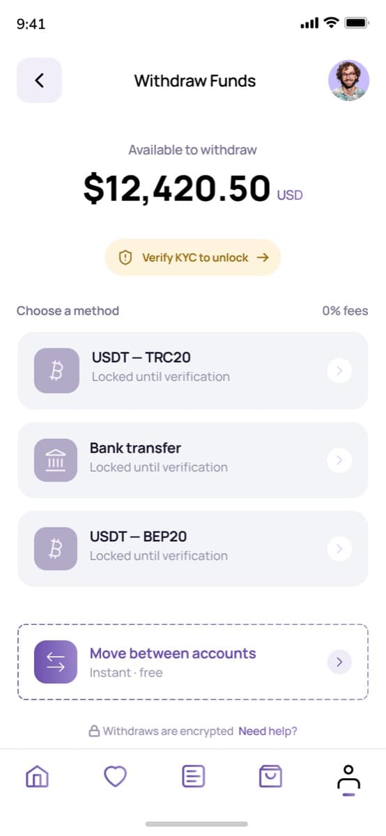
Locked: the balance and every method are visible, each one locked until verification.
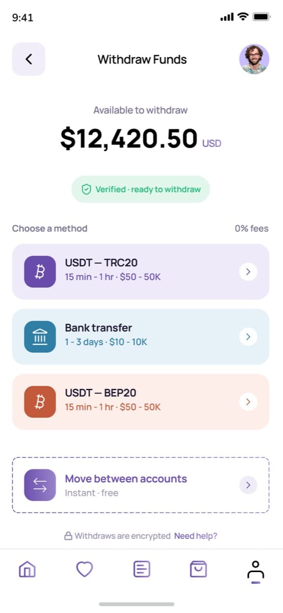
Verified: the same layout, now carrying real limits, timing, and 0% fees per method.
Moving your own money shouldn't feel like withdrawing it
Internal transfers get their own bottom sheet instead of reusing the withdrawal flow: pick an account, enter an amount, done — no limits, no fees, no waiting, because it never leaves the platform.
The sheet closes on a plain confirmation — amount, source, destination — instead of dropping the user back on the balance screen to guess whether it worked.
None of it holds together without a documented system underneath: a locked card and a verified card never drift apart, because two rules carry across every state.
Every number states its condition
"0% fees," "instant · free," "15 min – 1 hr" — timing and cost sit next to every method, verified or not, so nothing has to be assumed or looked up elsewhere.
One token set, light and dark
Color, type, spacing, and component radius are documented once and hold across both themes, so a dark-mode exploration is a palette swap, not a redesign.
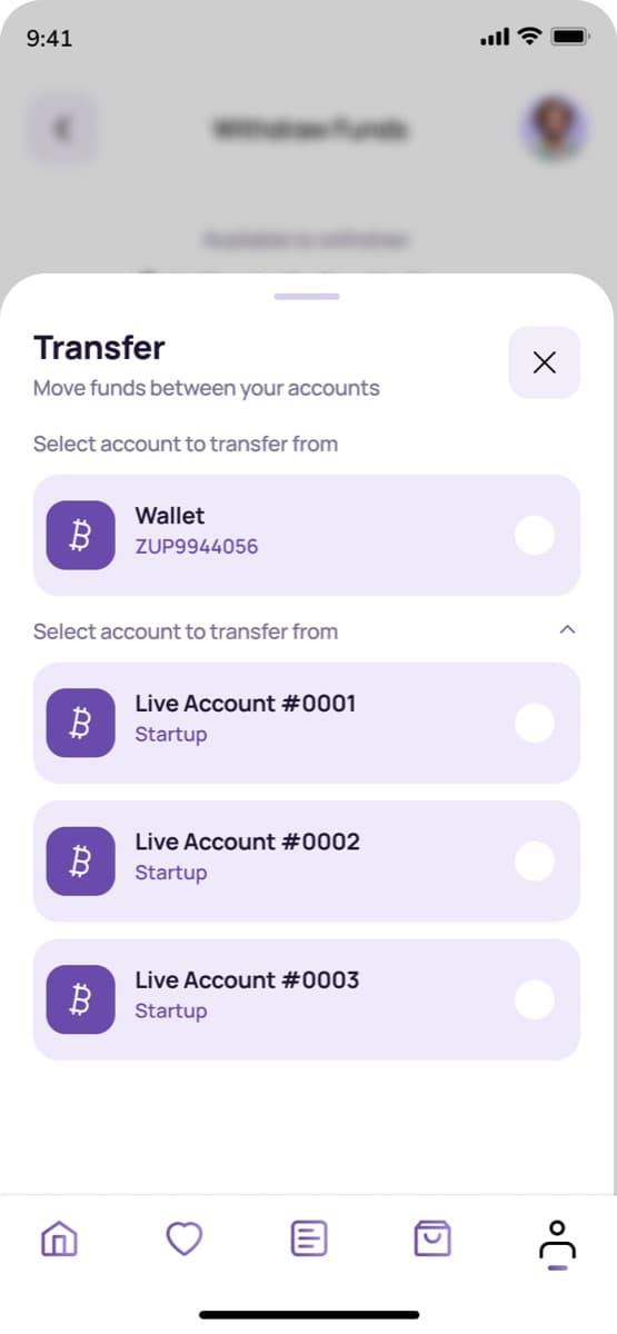
Selecting an account to transfer from.
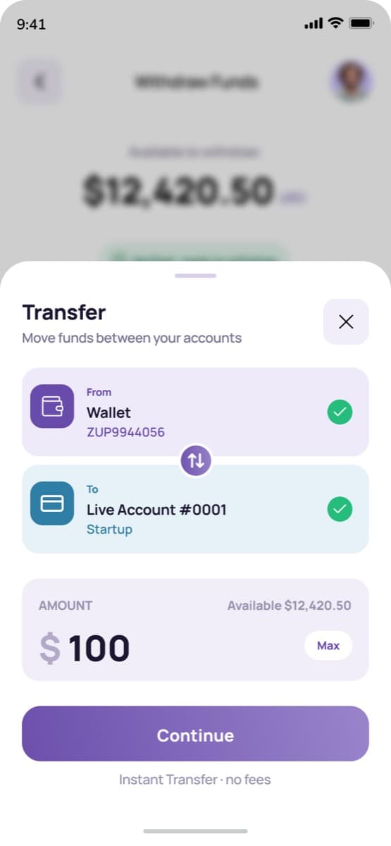
Entering an amount, with the balance and a Max shortcut in view.
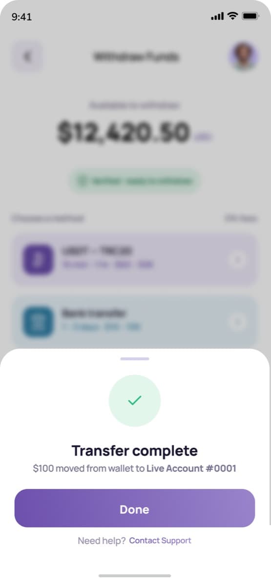
Transfer complete — what moved, from where, to where.
More from this project
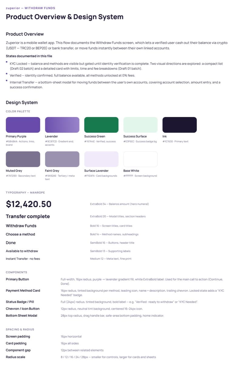
The system underneath: color palette, type scale, and component specs — documented once, reused everywhere.